TODAY, EIRCOM UNLEASHED their brand new logo and rebrand to Eir. The new logo is all part of a 16 million euro rebrand of the telecommunications giant .
Look at it there.

Modern, fresh, and definitely left an impression on the internet… But why is it so familiar?
1. It is literally this fictional cartoon. Let us hear no more about it

Whoops!
We couldn't find this Tweet
2. Drunk Octopus
3. EI EI EI
Whoops!
We couldn't find this Tweet
Tune.
4. A big pink worm
Whoops!
We couldn't find this Tweet
Hardly a stretch.

5. A guy attempting to reach the top shelf
Whoops!
We couldn't find this Tweet
Yep.

6. EBOLA
Whoops!
We couldn't find this Tweet
Harsh, but fair.
7. This guy
8. YES
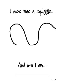
9. Just a damn squiggle

10. You probably accidentally created it as a child
11. But some thought it was smart
Whoops!
We couldn't find this Tweet
Not so silly now, eh?


COMMENTS (9)